What Is “Above the Fold” in Web Design?

For those who may not be familiar with web design terms, above the fold is another of the many phrases that can confuse people. It has been around since the beginning of the internet and is by no means going anywhere. It is an important consideration when designing websites so read on and find out why.
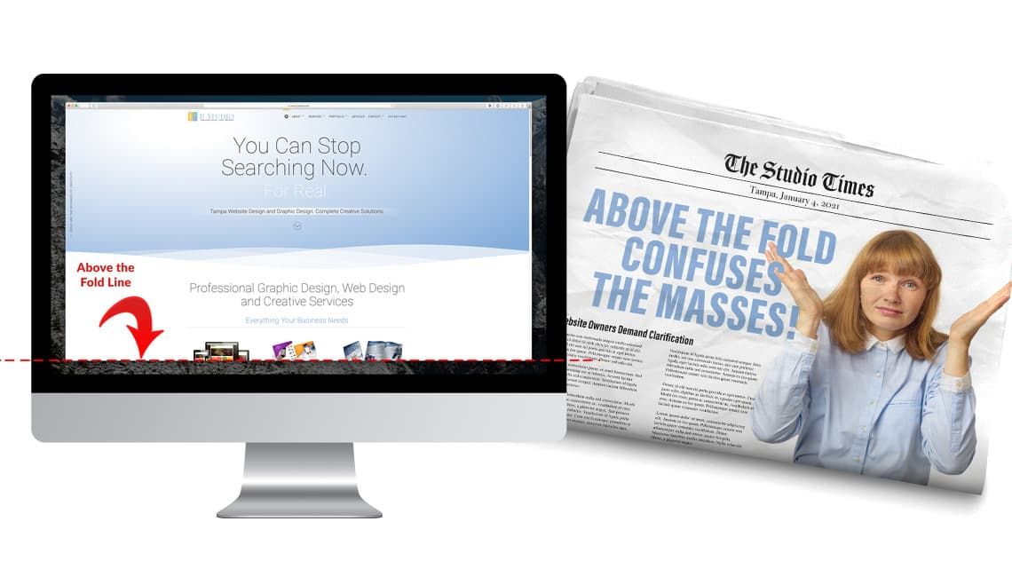
To answer this simply, “Above the fold” refers to the area of a web page that is visible above the bottom of your internet browser or window.
Where Above the Fold Came From
There are a great deal of parallels between the printing world and the realm of web design. Both disciplines share a good number of concepts. Though some of them are named a bit differently, they mean the same thing. We will stick with only one for this article: Above the Fold (ATF).
When you visit your local convenience store or grocery store to buy a newspaper, how is the item presented to you? More than likely it is folded in half. Whether it is sitting in a rack or on a shelf, it is still folded in half.
Ever have newspapers delivered to you in a hotel? It’s usually sitting outside your room, face up and folded in half. Even if your paper is delivered, or tossed into the bushes by someone flying by on a bicycle, once you uncurl the paper, it is still folded in half.
Because the paper is folded in half you are subsequently seeing only the top portion of the paper. You will see the name of the newspaper, the date and, more importantly, the main story or stories. You know, the ones that used to get the editors to shout “Stop the presses!”.
Everything you see in that top half is referred to as Above the Fold. And it makes perfect sense, right? Why would you have breaking news on the underside of the paper?
The same concept, or strategy, holds true for web design. Except, with websites, the content that you see above the very bottom of your internet browser window is considered above the fold. Make sense?
That may confuse some because web sites don’t fold. Laptops do and some may confuse this with the actual meaning of the term. But, to reiterate, everything visible above the bottom of your browser window is considered above the fold. But that area will be different based on a number of variables.
Above the fold differs between screen resolutions and devices
The browser wars of the 1990s and 2000s became the bane of many a web designer, and to some degree continues today. What one could do in one browser might not be allowed or be compatible with another. Internet Explorer was famous (or infamous) for this frustration. A consistent standard was lacking between the browsers to make web design more equal and cross-browser friendly.
To some degree this is also an issue today. A major difference between newspapers and web browsers is consistency is size. Newspapers were typically the same size. Therefore the Above the Fold area was predictable. This is not the case with web design and this has a direct effect on the area we call Above the Fold.
Screen Resolution
It’s probably a safe bet that you may have used a few different sized computer monitors in your lifetime. Between desktop computers and laptops the size differences are many. And not just physical size, as in a 17” monitor, a 19” monitor or a nice 27” monitor. Not only are these screens different in physical size, they can all differ greatly in screen resolution.
So what is screen resolution? Screen resolution is typically indicated with number pairs such as 1920 X 1080, 640 X 480, 800 X 600, 2560 X 1440 and so on. These numbers are indicating the number of pixels that make up the display you are viewing. 1920 X 1080, for example, indicates that there are 1920 pixels horizontally and 1080 pixels vertically that help make up the images and content on your screen. Also, as is true in printing (called line screen), the higher the number, also usually means the sharper the picture.
Device Sizes
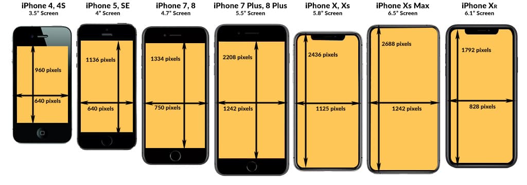
Not only are the screen resolutions different across devices, so are the actual physical sizes of the screens we view. Take the iPhone screen sizes image below, for example. The iPhone 4 has a screen size of 3.5” and a vertical resolution of 960 pixels. Compare that to the iPhone XS Max with its screen size of 6.5” and vertical resolution of 2688 pixels. Nearly three times that of the iPhone 4.

As you can see the “above the fold” area on these devices alone vary greatly. And we are only including the iPhone in this context. There are dozens if not hundreds more mobile phone models on the market today. You then might want to consider the hundreds of different computer screen sizes and resolutions. The thought can be mind boggling. So getting a consistent above the fold area is virtually impossible. So how do we try to accommodate the vastly different sizes?
Dealing with different above the fold sizes
Part of our problem is solved by responsive web design (RWD). RWD will allow content to reflow and resize properly depending on the device being used. But this can only go so far.
With that in mind it is usually a good idea to keep the content in this area to a minimum. This will afford the best chances that most users will be able to either view the content or act upon a call to action.
Keep Important Content Above the Fold
Consider how some brick and mortar establishments of varying business models place products at or very near the entrances to their facilities. These are usually items that the business owners would like you to engage with or at least consider on your initial entry. Go back to the folded newspaper - the publisher wants you to see the main headline and any other featured stories at first view. This should be taken into consideration with your website design as well.
What to include in the above the fold area?
For the Above the Fold area, many business look to include/begin a narrative that describes their business or their USP (Unique Selling Proposition) that continues down the page.
Other site owners like to include the once-popular (more on this later) slide show that showcases different products, services or features.
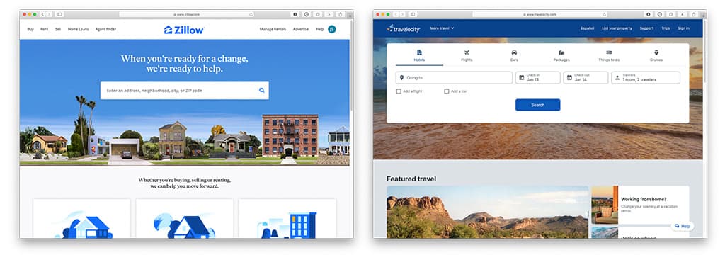
Calls To Action are also included in this valuable area. Adding a brief contact form or some type of user engagement device is a successful strategy employed by many. Consider a travel site or a real estate site, for example. Both typically include a form immediately above the fold that allows you to immediately state your intention by selecting a travel destination, or in the case of a real estate website, search for a particular home type in a certain area. Adding a call to action in the above the fold area is a great way to generate qualified leads and increase conversions.
Website owners that offer advertising on their site usually receive premium rates for ads that appear above the fold. Because those ads have a better chance of user engagement due simply to their position. Much like the coveted inside front cover or back cover in magazine advertising.
Whatever you decide to include above the fold there is one thing you will want to consider: it must load quickly!

The Importance of Page Speed and Above the fold
Page speed is a terribly important metric today when designing websites. Google has made no bones about this fact. It is not only important for the overall health and well being of your website, it is also critical for the above the fold area.
It is widely known that a good portion of your page speed score is directly related to how quickly the content above the fold loads and how quickly it is available for interaction by the user.
Depending on how your website was created, as well as the type of hosting environment you currently employ there are things you can consider including or not including to keep this part of your page loading quickly.
Avoid Video Backgrounds
Again, this will depend greatly upon how you site was developed and the type of hosting environment you are in, as well as other factors, but having a video background can add more load time to the above the fold area than it may be worth visually. Understandably most website owners want to have form and function. But at what cost? Videos can add beauty and context to a web page and can also help support any overlaying content or copy. If done right it can be a successful endeavor. If done improperly this can be detrimental to your page speed scores. Not to mention what it can cost you when Google rolls out the Core Vitals Update in the Spring.
Steer Clear of Slide Shows When possible
Web design has always found ways to improve its technology by offering cool features or behaviors. One of the more popular additions was the slide show. A slide show allows a site owner to show multiple slides in the same position. It offers a bit of movement, animation and potential user engagement. It can showcase multiple products, services, advertisements and more. All in the same position without the user having to scroll anywhere else.
A downside to this practice is load time. If your website has a slide show that contains 5 banners for example, the website will have to load all five of those images, as well as all the CSS and JavaScript files necessary to show the images and include the functionality of sliding, navigation and more. If these slides take up the full width of the site, these images can be quite large.
Moreover, there have been studies over the past several years that clearly show that users are no longer interested in hanging about to see all the slides. Heat maps have shown that users are steering clear of these features altogether.
Defer loading of all external files not necessary ATF
There are technical strategies that can be employed to decrease page load time, and therefore increase page speed score. Much of it has to do with deferring your website’s javascript files, compressing and minimizing html, css and javascript files as well as using next generation image formats. But this article is for website owners and not website developers so we will not delve into this rabbit hole. But it is certainly something you may want to make certain your local web design company is aware of.
These are just a few considerations to make when creating your website. The important takeaway would be to be very mindful of the above the fold area and make certain you are finding the best marriage between form and function for the greatest success.